Above is another video about Coronary Bypass Surgery, this time from BUPA. It is quite clear that there are several helpful visual guides to this surgery, but none are available from the NHS, which is where my visual leaflet will be aimed.
Thursday, 28 November 2013
Above is a link to a Youtube video about Coronary Bypass Surgery made by the British Heart Foundation. This is the only piece of media I have found so far (already existing) that could help patients who don't speak english as a first language, struggle to read, or understand things in a more visual way.


Sunday, 24 November 2013


Wednesday, 20 November 2013

Saturday, 2 November 2013


Thursday, 31 October 2013

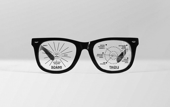
Because my infographic leaflet would be used for the NHS, there would obviously be a budget which means that colour might be too expensive if printing in bulk. Because of this, I intend to draw/produce my infographics in black and white 1. because it would be cheaper to print for the hospital and 2. because my style of drawing is also more suited to black and white. Below are some black and white information graphics which I think are successful.


I found another page on infographics, but this time celebrating the most successful infographics of the year http://www.wired.com/design/2013/10/13-sterling-pieces-of-data-viz-from-the-best-american-infographic-2013/. Here are my favourites/the ones I think are most successful from the list:


I found a fantastic page on Pinterest called 'Bad Infographics'. http://www.pinterest.com/binfographics/bad-infographics/ It is simply a page full of infographics that haven't quite worked, and hopefully this web page will help me to avoid some of the more obvious info-graphic mistakes. Below are some of (in my opinion) the worst offenders:


Subscribe to:
Comments (Atom)